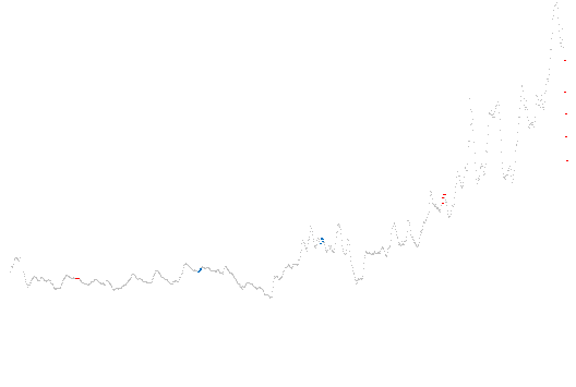
If you drive at all, you’ve probably noticed the plummeting gas prices lately. I had always heard that conservative incumbents reduce prices before an election, taking advantage of voters’ short-term memories—making the public think the economy is rosy. While I’d heard this, I didn’t know if it was actually true, so tonight, I found out.

The data is from August 1990 to present, with the month preceding presidential elections marked in the color of incumbent president’s party. If the theory was true at all, we’d expect to see dips in all the red streaks, but we don’t. We see:
- A large dip during this election (duh)
- A small rise in 2004
- Nothing noticeable in 1992, 1996, or 2000
Huh, I guess the myth was wrong (or I need more data).
PS: Excel 2007 was used to make this chart. I tried using Numbers first, which choked (miserably) graphing a relatively small dataset. OpenOffice.org Calc was next, but it couldn’t do the small dots I wanted. Why is this so hard? Is there a easier piece of software to use to make non-chartjunk? What do you use?
PPS: The red/blue dichotomy is actually relatively new—newer than all this data! Check it.