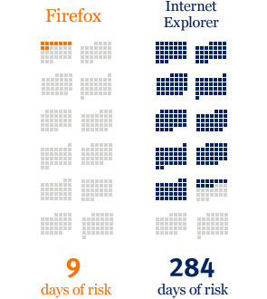
After upgrading to Firefox 3.0.11, I clicked around the landing page they send you to. I really liked the look and content of the pages. Something on the security overview caught my eye, though:

This was a great chart showing how many days using IE put you at risk vs. Firefox. It has a message to communicate, and it does it well. I couldn’t help thinking about Edward Tufte’s advice, though, so I rewrote it a little:

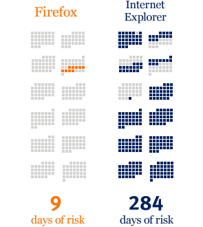
One principle Tufte teaches is that one shouldn’t be afraid of showing a lot of detail in a graphic. It doesn’t have to detract from the message, and if it takes the same amount of ink, err on the side of more data. Therefore, I found the dates the calendars were based off of, and actually filled in the days.
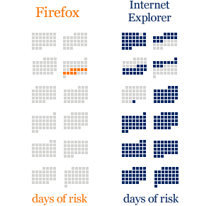
But there was still a problem. We have duplicated information in the shaded boxes and those numbers at the bottom. Revising once more, we get the final product:

The colored “days of risk” act as a legend, so I kept them. A tally of the number of boxes isn’t necessary to communicate that IE is a less secure browser than Firefox.
Now the only problem with the chart is that it’s based off data from 2006…