February 2009 Archives

TechCrunch wrote today about a great idea by a startup called Diomede:

While most data centers have their servers and disk drives operating 24/7 with near-immediate access, Diomede allows customers to designate files that they don’t need instant access to, and places them either as ‘nearline’ or ‘offline’.

People didn’t even realize they may not need all their data on-demand all the time, and because there was no demand for less than 24/7 access, cloud storage providers never thought of turning off some hard drives during the day. It’s great when a business can take advantage of an economic issue and an environmental issue aligning so perfectly.

♻ 42 Cents

| No TrackBacks

In my “Projects TODO” Google Doc, there is a bullet point reading simply “priceofstamp.com”—a single-serving site I was going to register and maintain. I am now able to strike it out since some kind soul created priceofastamp.com (the best you can do without dealing with domain squatters).

Of course, I bought a couple booklets of Forever Stamps exactly for this reason. I’m so great, I don’t even have to do; I can just think of an idea and it’ll happen.


A little disappointed in the choice of Arial. As John Gruber says: “There are two types of people in the world: those who can’t tell the difference between Arial and Helvetica, and those who despise Arial.”

♻ Spamusement

| No TrackBacks

Checking out my spam in Gmail, I saw this great subject line:

She’ll get sweaty when you enter the room because she has tested your amazing organ.

Ah, that’s awesome—wait, what? “sweaty”? I… didn’t know I wanted that.

I also love the fact that spammers have to resort to clever synonyms for “penis,” since too many spam filters block the word outright. Hence, my “amazing organ.”

All I can think about is how great of a Spamusement post this would be (if only it were still updated).

♻ Heuristic/ALgorithmic

| No TrackBacks

Now, I’m a sucker for the aesthetics of “2001: A Space Odyssey,” but I just rediscovered this Apple ad from the 2000 Super Bowl, and love it for reasons beyond those. HAL is so great to recontextualize—his utterly detached tone just makes it so easy!

♻ Wrong Division

| No TrackBacks

Came across a cool type of etymology today: wrong division (sometimes called “misdivison”). I stumbled upon it looking up the definition of “nonce.” Dictionary.app told me the following:

ORIGIN Middle English : from then anes [the one (purpose)] (from then, obsolete oblique form of the + ane [one] + -s 3 ), altered by misdivision; compare with newt and nickname .

Not easy to parse, but looking at “newt” told me that it, too, was formed by wrong division. Newts used to be called “ewts,” and when someone wrote “an ewt,” a boo-boo was made when someone re-read or heard it and it became “a newt.” (This also explains why efts grow up to be (n)ewts.)

But misdivision works both ways—there are another breed of words that lost letters, like “apron.” That’s right, they used to be called “naprons,” but “a napron” mutated into “an apron.”

Someone seems to have compiled a pretty comprehensive list. I think my favorite is “nuncle,” which means “a person’s uncle,” but was created by misdividing “mine uncle.”

♻ Frosty Processing

| 1 TrackBack

Looks like somebody’s taking another stab at implementing Processing in Flash. I’ll have to keep my eyes on Frocessing and maybe use it for my next project…

The first implementation I saw was Processing.as, which is kind of fun to play with, but can get bogged down pretty easily.

♻ Nohmygod

| No TrackBacks

Google Webmaster Tools just alerted me that people are accessing my website by searching for “fallatio” and “elder hos.” Great. I can only hope they enjoy the brief detour from porn searching and don’t immediately click away.

Fornicator Out!

| 3 Comments | No TrackBacks

A while ago, I was in San Francisco with my mom when I saw this guy on Market:

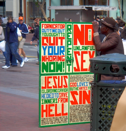
Striking, no? It seems to have caught the eyes of others, too. I love the characters because each (save ‘I’) fits into its own rectangle, but manages to do a lot with the constraint. Creative use of negative space (‘Q’, ‘M’, ‘W’, ‘B’) make the words feel like they’re chiseled out of a chunk of stone.

The colors and typeface are so great, I decided to pay homage to the man’s creativity and create a font so we can all be as loud as him. I downloaded FontForge, and after a few hours came up with this:

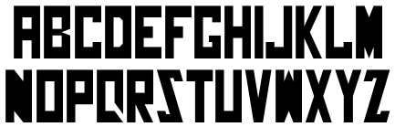
Much like a software application, I realized that you don’t appreciate all a nice font does until you have to make one yourself. My font (which I’ve dubbed “Fornicator Out”) only defines the characters A-Z!,, i.e., only the characters displayed on the poster. If you aren’t typing in caps, you aren’t loud enough for this font (also, FontForge’s copy/paste feature wasn’t working, so I couldn’t remap a-z to reference their counterparts).

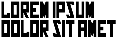
Give it a spin. It’s a TrueType font, so it works on both Mac and Windows. If you decide to use it, just give me (and Market Street guy who probably doesn’t like my fornicating) some credit: FornicatorOut.ttf.

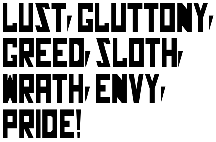
And now, some copy to whet your appetite for hating on “unlawful sex.”

The standard:

Let’s get into this repenting…

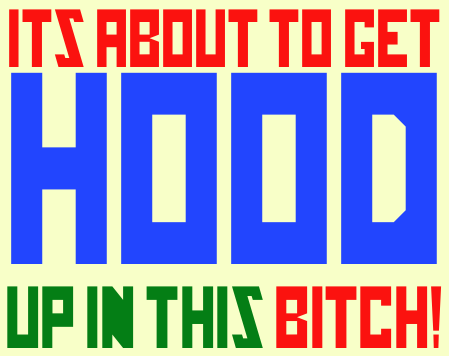
Of course, the real fun starts when you add color:

♻ Artifacts

| No TrackBacks

Watching this music video reminds me of watching WMVs in VLC. As Andy Baio says, “Yes, it’s supposed to look like that.”


Update: I guess it’s mainstream now:

♻ AdAge

| 1 Comment | No TrackBacks

Our company receives hard copies of Advertising Age—I’ve seen them lying around the office. The dead tree versions were fun to flip through, but I hadn’t really read it until today, when some co-worker left a copy …in the bathroom.

Holy crap: this weekly is tremendously informative and entertaining (and I’m not saying this with the bias of somebody working at an advertising company—much of it is not really applicable to us). AdAge provides insight on news from a different perspective, of course, with large emphasis on branding and advertising.

Let’s take a look at some of the articles from the past couple issues of AdAge, so I can convince you that this trade magazine is genuinely interesting:

Google Reader just got a little bit bigger.